
Are your visitors struggling to use your website on their phones?
If your site isn’t mobile-friendly, you could be losing traffic and lowering your SEO rankings without even knowing it. Mobile users expect fast loading times, easy navigation, and clear content.
In this guide, you’ll discover practical steps to make your site mobile-friendly, improve user experience, and boost your SEO so your visitors stay longer and Google takes notice.
Why Mobile-Friendly Websites Matter
Think about the last time you browsed the internet on your phone.
If a site loaded slowly or the layout was messy, did you stick around?
Probably not.
Your visitors are the same.
If they have to zoom in to read or struggle to click buttons, they’ll leave.
Google knows this. That’s why being mobile-friendly is now a big deal for SEO.
The easier your site is to use on a phone, the better your chances of ranking higher.
What Does “Mobile-Friendly” Really Mean?
A mobile-friendly site should:
- Adjust automatically to different screen sizes (responsive design)
- Load fast, even with slow internet
- Have text that’s easy to read without zooming
- Make buttons and links easy to tap
- Keep everything neat and organized on small screens
In short, it should work without making people frustrated.
Why Mobile-Friendly Matters for SEO
Google now uses mobile-first indexing.
That means it looks at your mobile site first when deciding where to rank you.
If your site isn’t mobile-friendly:
- Visitors leave quickly
- Sales or inquiries drop
- Your rankings can suffer
If your site is mobile-friendly:
- People stay longer
- They explore more pages
- Your business looks more trustworthy
- Google “likes” your site more
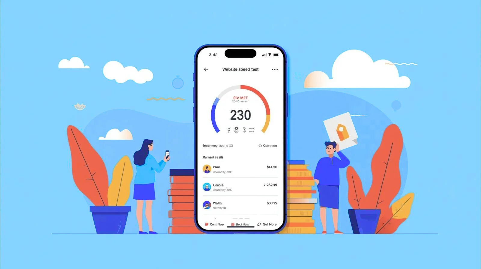
How to Check If Your Site Is Mobile-Friendly
- Google Mobile-Friendly Test
- Go to Google’s Mobile-Friendly Test
- Enter your site URL
- Check the results
- Google Search Console
- Look for the Mobile Usability section
- See if Google finds issues like tiny text or crowded buttons
- Test It Yourself
- Open your site on your phone
- Scroll, click menus, read the text
- Is it smooth and easy?
How to Make Your Site Mobile-Friendly
1. Use a Responsive Design
A responsive design automatically adjusts your layout for any screen.
If you use WordPress, choose a theme that’s already mobile-friendly
2. Improve Loading Speed
Mobile users don’t wait long.
If your site takes more than 3 seconds, they’ll likely leave.
Tips:
- Compress images with tools like TinyPNG or Squoosh
- Use caching plugins (WP Rocket, W3 Total Cache)
- Pick fast, reliable hosting
3. Make Text Easy to Read
Tiny text on a phone = instant frustration.
- Use at least 16px for body text
- Keep paragraphs short
- Use headings and bullet points for clarity
4. Optimize Your Images
- Use the right image size for your layout
- Convert to WebP for faster loading
5. Space Out Buttons
Buttons should be big enough and spaced well to avoid “fat finger” mistakes.
6. Avoid Annoying Pop-Ups
Full-screen pop-ups on mobile can drive visitors away. Keep it subtle
7. Test on Different Devices
A site might look fine on one phone but broken on another. Test regularly
Bonus Mobile SEO Tips
- Keep titles short and clear
- Put key content “above the fold” so it’s seen first
- Make sure forms are easy to fill out on mobile
Common Mobile Mistakes to Avoid
- Designing only for desktop
- Using oversized images
- Having hard-to-use forms
- Skipping updates for themes or plugins
Why This Is Worth Your Time
A mobile-friendly site means:
- Visitors stay longer
- You get more leads or sales
- Your rankings improve
- Your brand feels more professional
Mobile-friendliness isn’t just about pleasing Google it’s about giving your visitors the best experience possible.
If they enjoy your site, they’ll come back… and maybe bring friends.
Keep Your Site Mobile-Friendly
A fast, easy-to-use mobile website keeps visitors happy and boosts your SEO. Even small improvements like faster loading and clear navigation make a difference.
Want an easier way to stay mobile-ready? Manage My Site helps you optimize and monitor your site in minutes.
Give your visitors the experience they expect start improving your site today.


